Need Creative input...
One year after my move, I finally ready to print my new business cards. The front will have a hair embroidery and all the contact information, and the back will have a painting detail. I am trying to decide WHICH painting detail should go on the back.


Please give me your input. If I still lived in Miami I would be bugging all my friends to do this, but up here, Radley & Kevin are the only ones I see with any regularity, and Radley's attention span isn't long enough to give me an answer. You click on "comments", and if you do not have a blogger profile (which only takes a moment to do and costs no money), you can enter your opinion annonymously. The "type the letters you see above" thing is to avoid spam. You keep mentioning the blog in your emails, so I know you're out there reading. Help. I am living in Burlington. I have virtually no one to ask. My neighbors are all retired Republicans.
One year after my move, I finally ready to print my new business cards. The front will have a hair embroidery and all the contact information, and the back will have a painting detail. I am trying to decide WHICH painting detail should go on the back.
Please give me your input. If I still lived in Miami I would be bugging all my friends to do this, but up here, Radley & Kevin are the only ones I see with any regularity, and Radley's attention span isn't long enough to give me an answer. You click on "comments", and if you do not have a blogger profile (which only takes a moment to do and costs no money), you can enter your opinion annonymously. The "type the letters you see above" thing is to avoid spam. You keep mentioning the blog in your emails, so I know you're out there reading. Help. I am living in Burlington. I have virtually no one to ask. My neighbors are all retired Republicans.
posted by Kate at 6:49 PM
![]()
![]()


10 Comments:
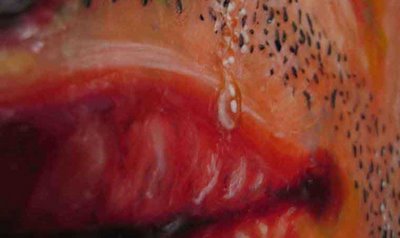
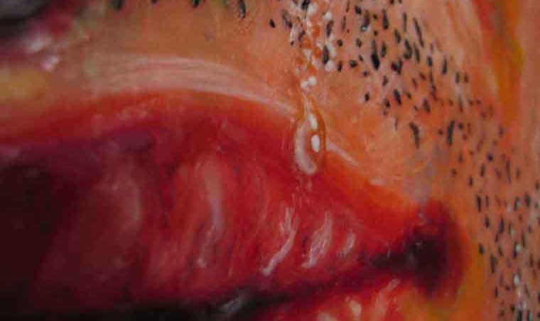
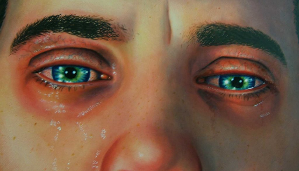
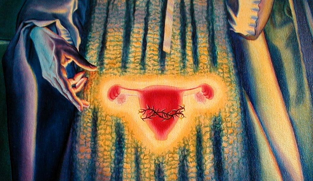
I like choice number one. It's intriguing and invites a closer look. For me, number two is sort of scarey and sad and number three is too female. good luck.
I like choice #3, followed by #2, followed by #1. I like the image and idea of number one, but the upper lip has always bothered me--it looks sort of not real to me. Not the crying, just the lip. Number 3 makes the clearest statement to me-if that's the statement you want to make. I guess it depends on which direction you are planning to take your work in next--you should go with the image that most represents your next direction.
So far I have 2 email votes for #1, and one email vote for #2. (Fear of blogging, I guess.) Upon further thought, as a business card, these things might be looked at upside down, and the lip might be too ambiguous? #3 shows my sense of light, and probably best represents the next work I am going to do, but I have had my work written about in feminist terms for so long, and want people to look at it a different way, so maybe Sacred Ovaries is not the best for accomplishing that goal.
#3 is my first choice, but after reading your entry above, i'll vote for #2
Hmm. If I had to choose... 3. Less specific, invites examination and decryption. Contains major themes and palates. -Bob.
DAMN! i can't see any of the above on a new bus. card. Love the hand in #3, but the feminist label might stick with the sacred ovaries...why not a diff. detail? Or 3 dif. choices for us to choose from ;) BUT if those are the only options...I'd pick #2 and crop out the nose.
Great eye, Jennifer... how funny. I decided late last night on #2, but cropped out the nose before I sent it to press, and it works much better... it's much more intense. If the feminist thing weren't an issue, I would have gone with #3, but I really have to steer people towards talking about something else in my work.. no one wants to be pigeonholed/a one-liner.
I like #1. The small detail looks good blown up. #3 is a great image. I worry though with all the small detail getting lost.
Chris...
I like #1. #2 conveys that all you might see is sadness while #3 is too focused on women's view of themselves. Just my thoughts, you can take them or leave them.
The eyes are it. They do make me want to cry.
Post a Comment
<< Home